Thursday, 24 May 2012

Assignment 3: Storyboard: The Ugly Duckling: Scene Descriptions


Slide 1:
Fade In
The egg begins to crack.
It releases a fragment with text upon it.
The opening track begins to play.
The Fragments flies past the screen in slow motion.

Slide 2:
The Egg begins to wiggle.
Another Fragment breaks away.
It is launched off-screen.
The fragment appears in the foreground with text etched into it.

Slide 3:
The egg breaks apart.
Lightning booms in the background.
A small duckling emerges from the shell.

Slide 4:
The duckling turns his head to look at the background.
A tree is alight from the lightning.

Slide 5:
Pulley audio is applied.
Title text is lowered into the scene.
The duckling looks up at the text.  
The background fades away.

Slide 6:
The text remains stationary above the duckling.
The duckling has a dumbfounded expression.
Opening track ends.
Fade out

Assignment 3: Storyboard: The Ugly Duckling


Wednesday, 9 May 2012

Brief Writing Exercise: Sample Images A4


Breif Writing Exercise: Written Component A4

Design Brief: A book cover for a biography of Steve Jobs
Job Type: Design a book cover for a biography of former apple CEO, Steve Jobs.

The design should be an intricate mosaic of his technological creations, yet through the use of shape and a black background these creations will form an image of his face presenting a clever persona.

This design will convey messages of:
  •         Creation
  •         Technology
  •         Genius
  •         Sophistication
  •         Complexity
  •         Intelligence


The design should include the following: 
  • All of Steve’s “MAC” and technological creations forming an image of his face from a front on perspective. 
  • His face should be contemplative with him looking upwards as if thinking of new ideas.
  • The background will be entirely black with most of his facial structure being certain lighter shades of whites and yellows. This will create a detailed image recognizable as both Mac creations and Steve’s face. Ultimately creating a major contrast between the background and the facial image. 
  •  The facial image will be central to the cover and will apply for two thirds of the entire space of the cover.
  • Text will be bold and simple. Up the top above the image text will say “Steve Jobs” and underneath the image will say “ Life of a Genius”.
The design should be intended not only for people who know Steve from his creations but also who are generally interested to explore an intellectually genius mans mind. The design will not apply to age specific groups or cultures. It will be purely Steve Jobs as a Genius and through the design will convey that message to everyone whatever their age and lifestyle.

The dimensions of the design will be 297mm H x 210mm W to accommodate for not only the large A4 Collectors Edition of the book but also the standard paperback novel size.


Deadline: Friday, 18th May 2012
Initial concepts and designs should be sent to me via my email bellow.
Formats can be either jpg or png with file sizes no more than 6MB.
Quote me the cost by giving me a call on my mobile and we can work something out.


Thank you, Good Luck!


 James Oppy
Home Phone: (03) 5821 3473
Work Phone: (03) 5821 8745
Mobile: 0477088956 

Thursday, 3 May 2012

Illustration With A Social Conscience: Poster 2, Horizontal third of an A4 page


Illustration With A Social Conscience: Poster 1, A4 size


Illustration With A Social Conscience: Sketches and Thoughts

Whilst researching prostate cancer for my assignment, I found certain posters for the organisation Greenpeace. I really liked their use of natural colours and styles and decided to completely change my poster design. After originally planning to do a re-make of the KONY 2012 posters to Prostate Cancer awareness, it felt right to try something completely different with two greenpeace posters. I went on their website and had a look at a few of their current projects. One that stood out for me was " Logging" and inparticular "Rainforest Logging". I created this rough sketch of what I had in my mind and already began working on certain taglines such as:
> Logging Kills
> This is YOUR Earth
> Help us stop Rainforest Logging
>Your enviroment needs YOU

I then had an idea to use the little figures of men  I originally had planned for the "Prostate Cancer Posters" and turn hundreds of them into a figure of a tree. I believe this had a relevance to us as the audience and nature as one. Visually I wanted to convey ideas of "One-ness" and through this process of having nature, humanity and that particular aspect of trees as the same entity. From this idea I would be able to slant logging as a bad thing for it would be quite literally affecting "US" and would put certain visuals in the audiences mind. Both pictures were created for two different audiences.
One poster will have a more positive visual representation identifying more with focusing on "we are in this together" and "we can work together to stop logging". It will visually be brighter and will focus on bright colours like yellow's and greens. While the other poster will focus on negative aspects of logging such as visually showing the devastation that has already occured through Rainforest Logging. This will be shown as seen above through cut down trees darker colours and red strong text delivering the message.

Wednesday, 14 March 2012

ASSESSMENT 01- TASK A THATS RUBBISH! - After Thoughts

ASSESSMENT 01- TASK A THATS RUBBISH! 
After Thoughts 
I believe my final piece shows how i perceive rubbish. I created a tower of rubbish that seems to be living and growing much like the rubbish I see when I walk to university. Each and every time I woke up there seemed to be more. This piece represents the growth of rubbish as a single entity that has come to life from objects I found around my neighborhood. Having it presented in a tower form allowed me to adapt my alphabet on to each and every single coffee cup. I wanted the text to be crisp and clean much like the logo's that had been on the cups before I photoshopped them. Giving that strong contrast between the blobby explosions of grime that collects on the thrown away materials and the strong letterform of the alphabet allowed me to adapt both elements as one. This piece shows clearly the rapid evoultion of rubbish and the "life" it presents aswell as adapting the elements of the alphabet.

ASSESSMENT 01- TASK A THATS RUBBISH! - Final Piece

ASSESSMENT 01- TASK A THATS RUBBISH! 
 Final Piece

ASSESSMENT 01- TASK A THATS RUBBISH! - Rubbish Materials

Different Rubbish Materials I plan to Use in my Assessment:


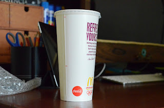
McDonalds Cup

McDonalds Coffee Cup


Various Rubbish Bags and Paper

ASSESSMENT 01- TASK A THATS RUBBISH! List of Rubbish Items

ASSESSMENT 01- TASK A THATS RUBBISH!
List of rubbish items identified on my travels:

  • Coffee Cups 
  • Soft Drink Bottles 
  • Plastic Bags 
  • Tin cans 
  • Organic Waste (dead leaves in compost)
  • Various Wrappers of lollies 
  • Paper Bags 
  • Used Condoms 
  • Ripped Dirty Underwear 
  • Crushed Pens 
  • Various drinking straws 
  • Boxes 
  • Alcohol Bottles

ASSESSMENT 01- TASK A THATS RUBBISH! Definition of Rubbish


ASSESSMENT 01- TASK A THATS RUBBISH! 
Definition of Rubbish and ideas
Rubbish in my eyes can be seen as treasure to another, so I have to make sure to choose items I believe rubbish to be anything that is not useful to me on a personal level. that I truly deem as “Rubbish”.  I live very close to a McDonalds restaurant from which most of the rubbish I know comes from. On my usual walk to university I come across various bottles and cups that have been littered along the paths I travel. I want to incorporate these cups and bottles in a way that I see them. Each and every day there seems to be more and more cups accumulating along my walkways giving me this sense that rubbish is “growing” and “piling up”. From these few key words I want to be able to create a living rubbish tower from the empty McDonalds cups I find in my neighbourhood.  I will collect what I can find on my usual walk from my house to Vic University. To incorporate the alphabet side of the assessment I will use it as a form of branding on various rubbish items I find.  Usually when I see rubbish like cups, bottles and bags they all seem to have a logo on them from which they originated. I want to eliminate any connection from which the rubbish came from and harness it as a universal form of rubbish such as a “Used Coffee Cup” not a “Used McDonalds Coffee Cup”. I believe this creates rubbish as a single entity not various forms of identifiable logos mish-mashed together in an image. What I am going to create will be from rubbish objects that exist within the neighbourhood I live in. Now all I have to do is collect them and bring them home to be adapted into my assessment.

Week03_Workshop_01

...3D TEXT... 
Another great tutorial. What I got most out of it was the appliance of texture to text and the creation of realistic clouds.

Week02_Workshop_04

...RETRO EFFECT... 
I loved this tutorial. It was really easy to create and that grunge like texture we can see through the image really gives it that depth and realism. I was trying to replicate this effect for years until I was taught how the other day.  

Week02_Workshop_03

...GRADIENT TOOL...

Week02_Workshop_02

...CREATE YOUR OWN BRUSH IN PHOTOSHOP...

Week02_Workshop_01

....IMAGE INTO TEXT......

Week01_Workshop_01